In This Guide
- Why Outfit Choice Matters More Than You Think
- The Golden Rule of Family Photo Outfits
- Spring Colour Palettes
- Summer Colour Palettes
- Fall Colour Palettes
- Winter Colour Palettes
- What to Avoid
- Practical Tips for Every Family
- Frequently Asked Questions
Why Outfit Choice Matters More Than You Think
Let me start with a confession. One of the most common questions I receive from family photography clients is “What should we wear?” And I completely understand why. You want your family photos to look beautiful, coordinated, and timeless. The last thing you want is to look back at your photos in five years and cringe at your outfit choices.
Here is the good news — it is not as complicated as you think. You do not need a professional stylist. You do not need to spend a fortune on new clothes. You just need to understand a few simple principles that will make your family photos look polished, intentional, and gorgeous in any season.
According to a 2024 survey by the Professional Photographers of Canada, 67% of clients say outfit planning is their biggest source of stress before a photo session. That number is even higher for larger families. However, the solution is surprisingly straightforward. Once you understand how colours work together — and what to avoid — the whole process becomes enjoyable instead of stressful.
| Stat | Figure | Source |
|---|---|---|
| Clients Stressed About Outfit Choice | 67% | Professional Photographers of Canada, 2024 |
| Most Popular Family Session Season | Fall | Edmonton Photography Trends, 2025 |
The Golden Rule of Family Photo Outfits
Coordinate, do not match. This is the single most important piece of outfit advice I give to every family. The days of everyone wearing identical white shirts and khaki pants are over. Thank goodness.
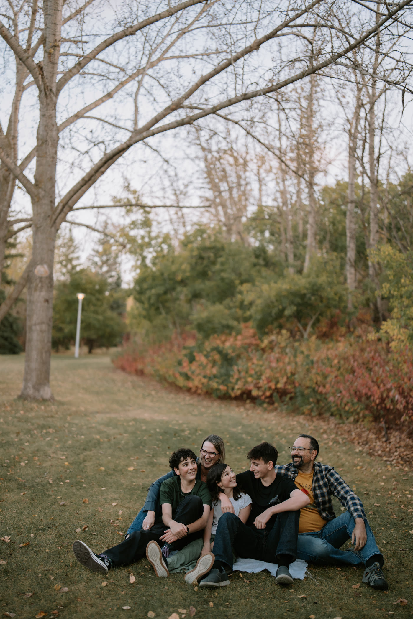
Instead, choose a colour palette of 3 to 4 complementary colours and distribute them across your family. Mom wears one colour, dad wears another, kids mix in the remaining tones. Everyone looks connected and intentional without looking like a uniform. The result is visual harmony — each person is distinct, but the family looks like they belong together.
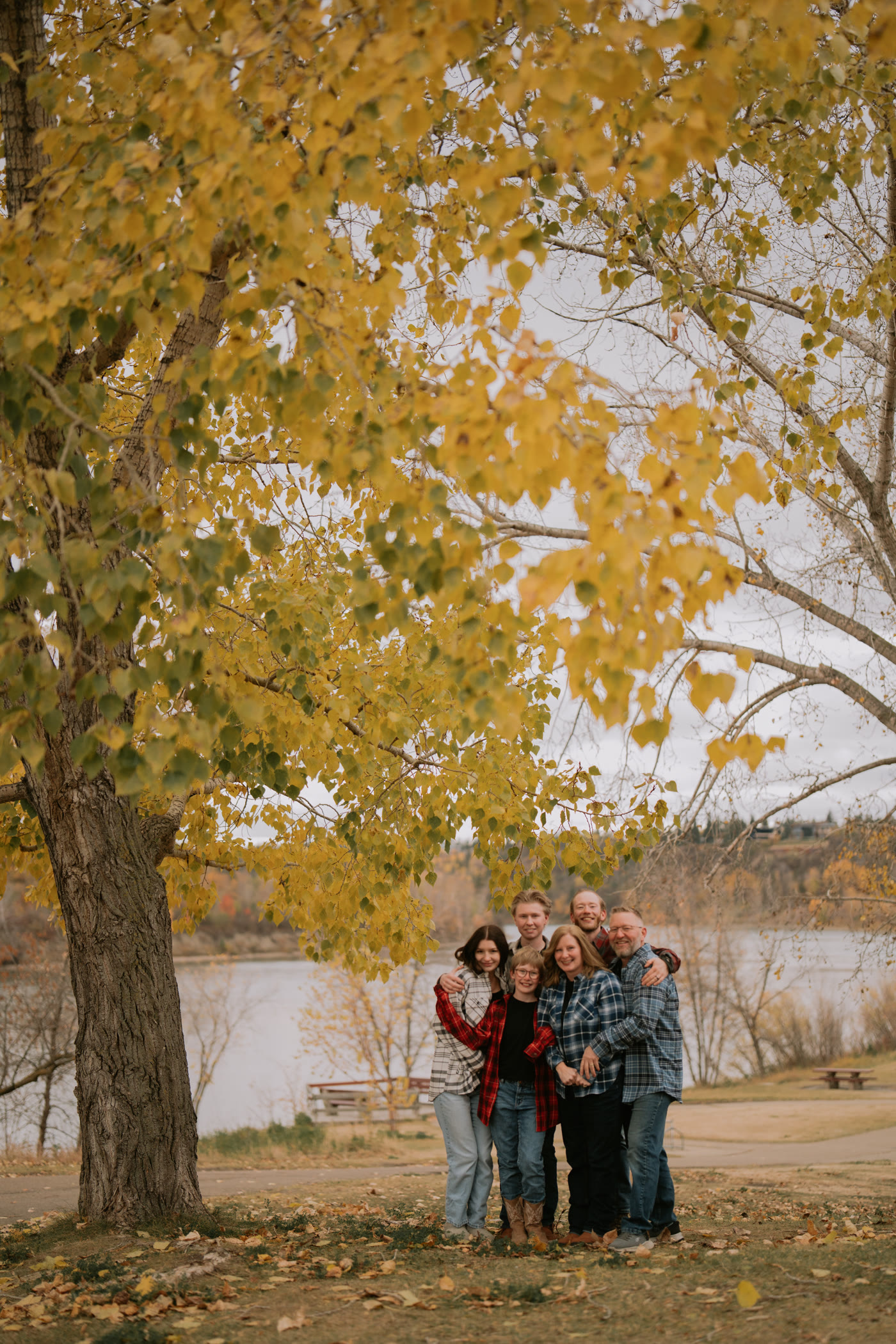
For example, an autumn family session might use this palette: deep burgundy, warm cream, olive green, and soft rust. Mom wears the burgundy dress. Dad wears a cream henley with olive trousers. One child wears a rust sweater. Another wears cream with burgundy accessories. Everyone coordinates without matching. Moreover, the palette complements the fall foliage in the background.
Photographer Tip
Start with one “anchor” outfit — usually mom’s. Choose one statement piece you love and build the rest of the family’s outfits around its colour palette. This makes the whole process much easier and prevents decision paralysis. In addition, laying out all the outfits on a bed together before the session lets you see how they work as a group.
Spring Colour Palettes
Spring in Edmonton is fresh, green, and full of new growth. The landscape provides soft greens, white blossoms, and blue skies as your natural backdrop. Your outfits should complement this fresh, airy feeling.
Palette 1: Soft Pastels
Dusty rose, sage green, soft cream, and light blue. This palette feels gentle and romantic. It works beautifully against blooming trees and fresh grass. The muted tones will not compete with spring flowers in the background. Instead, they create a harmonious, cohesive image.
Palette 2: Warm Neutrals with a Pop
Tan, warm white, camel, and one accent colour (like mauve or blush). This palette is timeless and elegant. The neutrals keep the focus on faces and expressions while the accent colour adds visual interest. It photographs beautifully in any setting — from river valley paths to urban Edmonton backgrounds.
Palette 3: Blue Tones
Navy, chambray, dusty blue, and cream. Blues are universally flattering and work year-round, but they are especially beautiful in spring when the sky is clear and the grass is bright green. The contrast between blue outfits and green foliage creates stunning colour separation in photos. As a result, every family member pops against the background.
Summer Colour Palettes
Summer in Edmonton means lush green landscapes, warm golden light, and extended golden hours that last until 10 PM. The rich greens and warm tones of summer create opportunities for both vibrant and neutral outfit choices.
Palette 1: Earth and Terracotta
Terracotta, warm cream, tan, and soft olive. This palette feels warm and natural. It connects beautifully with summer’s earthy tones — golden grass, warm tree bark, and sandy paths. The terracotta adds warmth without being overwhelming. Moreover, these tones look incredible during golden hour when everything is bathed in warm light.
Palette 2: Bright and Fresh
White, soft yellow, light green, and natural denim. This palette captures the energy of summer. It feels fresh, fun, and relaxed — perfect for families with young children who bring their own energy to the session. That said, avoid pure white for everyone. Mix in the other tones so the group does not look washed out against bright backgrounds.
Palette 3: Jewel Tones
Emerald green, deep teal, gold, and warm ivory. Summer’s rich green backdrop allows bold jewel tones to shine without clashing. This palette is especially beautiful for family portraits at botanical gardens or lush park settings. The deep colours add sophistication and photograph as timeless rather than trendy.
Fall Colour Palettes
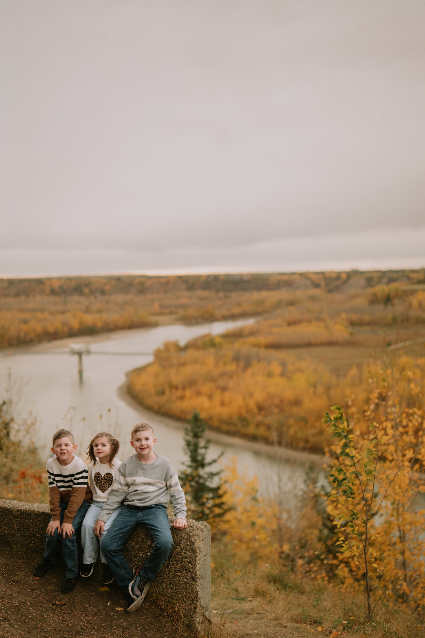
Fall is the most popular season for family photos in Edmonton, and for good reason. The golden and red foliage creates a stunning natural backdrop that elevates every image. However, fall is also where outfit mistakes happen most often — usually because families try to match the foliage instead of complementing it.
Palette 1: Rich Earth Tones
Burgundy, mustard, cream, and chocolate brown. This is the quintessential fall palette and it works every single time. The burgundy and mustard reference the autumn leaves without matching them directly. Cream provides brightness so the family does not disappear into the background. The browns ground everything. In fact, this palette has been my most recommended for Edmonton fall sessions three years running.
Palette 2: Moody and Sophisticated
Deep forest green, charcoal, plum, and warm taupe. This palette works beautifully in late fall when the leaves have partially dropped and the landscape turns more muted. The deeper tones add sophistication and work well for families who want a more editorial look. Moreover, these colours age well — they will look stylish in ten years, not dated.
Palette 3: Warm Neutrals
Camel, ivory, rust, and warm grey. This palette is subtle and elegant. It does not compete with fall foliage at all — instead, it lets the autumn colours be the star while the family remains the focal point. This is my go-to recommendation for families who are nervous about bold colours. The neutrals are safe but still look intentional and coordinated.
Fall family photos are not about matching the leaves. They are about complementing them. Your family should stand out from the background, not blend into it.
Winter Colour Palettes
Winter family sessions in Edmonton are magical — fresh snow, frost, soft blue light, and cozy layered outfits. The key to winter palettes is warmth. Against white snow and bare grey trees, warm tones make your family glow. On the other hand, cool tones can make everyone look cold and washed out.
Palette 1: Classic Winter Warmth
Red, cream, charcoal, and tan. Red against snow is a timeless combination. It is warm, cheerful, and instantly eye-catching. However, use red as an accent — one or two family members maximum. Too much red overwhelms. Balance it with cream and charcoal for depth and sophistication.
Palette 2: Cozy Neutrals
Ivory, oatmeal, soft brown, and camel. This palette creates a soft, dreamy look against snow. Layered knit sweaters, scarves, and wool coats in these tones photograph beautifully. The monochromatic approach feels elegant and cohesive. In addition, these colours let the winter landscape provide the contrast.
Palette 3: Berry and Navy
Deep navy, berry, dusty rose, and cream. This palette adds colour without the full brightness of red. Berry tones are flattering on virtually every skin tone and look rich against winter backgrounds. The navy provides a strong anchor colour for coats and trousers. As a result, the palette feels both warm and sophisticated.
What to Avoid
This section might save your family photos. Here are the most common outfit mistakes I see — and they are all easily avoidable.
All black. Black absorbs light and hides detail. In a family photo, an all-black outfit turns you into a dark shape with a floating head. One person in a black accent piece (jacket, boots) is fine. An entire family in black is not. However, dark charcoal is a great alternative that provides the same slimming effect while still showing texture and detail.
Neon and bright patterns. Neon colours reflect onto skin and create colour casts on faces. Bright busy patterns distract the eye and compete with faces for attention. Your eyes should go to expressions, not to a loud Hawaiian shirt. Moreover, large logos and graphic tees date photos instantly and pull focus from the family connection.
Matching exactly. Four people in identical white shirts and jeans looks like a uniform, not a family. Coordinate your palette instead. Same colour family, different shades and textures. This creates visual interest while maintaining cohesion.
Clashing textures on camera. Some patterns — particularly thin stripes and small checkers — create a visual effect called moire in photographs. The pattern appears to shimmer or wave in the image. Solid colours or subtle textures (like knit, linen, or soft plaid) photograph much better.
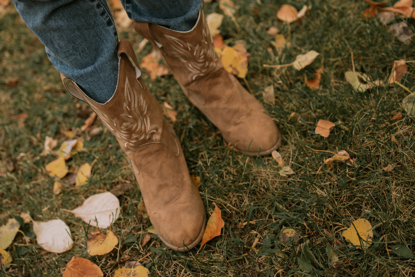
Brand new shoes. This sounds oddly specific, but hear me out. New shoes are often uncomfortable, which shows in your posture and expression. Wear shoes you know are comfortable. Your photographer will not be shooting your feet — but uncomfortable shoes will affect your face. Of course, if your shoes are visible in the frame, clean and polished is better than brand new.
Avoid Instead Try Why
All black Charcoal, navy, or dark olive Shows texture and detail without absorbing all light
Neon colours Muted or jewel-toned versions No colour reflection on skin
Exact matching Coordinating palette (3-4 colours) Visual interest while maintaining cohesion
Thin stripes Solid colours or subtle textures Avoids moire pattern in photos
Large logos Plain or subtly textured pieces Focus stays on faces, not branding
Practical Tips for Every Family
Here are the tips I share with every family before their session. These apply regardless of season, location, or family size.
- Dress in layers. Layers add visual texture and dimension. They also let you adjust for temperature and create outfit variety by removing a jacket for some shots. A family in layered outfits always looks more interesting than a family in single-layer tops.
- Iron or steam everything. Wrinkles show in photos. It takes five minutes to press your outfits but makes a noticeable difference in the final images. This is especially true for light-coloured fabrics where wrinkles catch shadows.
- Consider your backdrop. If you are taking photos in a green park like Hawrelak Park, avoid wearing green. You will blend into the background. If you are shooting against red autumn leaves, avoid wearing red for the same reason. Your outfit should complement the background, not match it.
- Dress kids last. Children have a talent for getting dirty between getting dressed and arriving at the session. Dress them in the car at the location if you can. Moreover, bring a backup outfit for young children. Spills happen.
- Accessorize thoughtfully. Hats, scarves, blankets, and jewellery add personality and visual interest. However, keep accessories simple and complementary to your palette. A statement necklace or a felt hat can elevate the entire look.
- Comfort is king. If you are tugging at your outfit, adjusting your waistband, or wobbling in heels on uneven ground, it will show in your photos. Wear clothes that fit well and feel good. Confidence is the best accessory you can wear.
Photographer Tip
Not sure about your outfit plan? Send me a photo of the outfits laid out together before your session. I am happy to give feedback and suggest adjustments. This takes two minutes and prevents outfit regret. Most of my family session clients take advantage of this and love the peace of mind.
Key Takeaways
- Coordinate your colour palette — never match exactly
- Start with one anchor outfit and build the rest of the family around it
- Choose colours that complement your season and backdrop, not match it
- Avoid all black, neon, thin stripes, large logos, and exact matching
- Layer your outfits for texture, dimension, and temperature flexibility
- Send your photographer a photo of outfits laid out for quick feedback
Planning a Family Photo Session? I help every family with outfit guidance, location selection, and timing for the best light. Let me know what season you are thinking, and I will send you customized colour palette suggestions. No stress, just beautiful photos. Book a Free Consultation
Frequently Asked Questions
Can we bring a change of outfits? Absolutely. A wardrobe change adds variety to your gallery. I recommend one coordinated outfit for formal group shots and a more casual, layered option for candid and playful shots. We can switch midway through the session. Just keep in mind that the change takes a few minutes of your session time.
What if my teenager refuses to dress up? This happens more often than you would think. My approach is to work within their comfort zone. If they insist on jeans and a hoodie, we choose a hoodie colour that fits the palette. Often, giving teenagers some autonomy over their outfit — within the colour guidelines — gets better cooperation than demanding a specific outfit. The photos turn out beautifully either way.
Should we buy new clothes for the session? Not necessarily. Start with what you already own and see if it fits a coordinated palette. Many families find that they have everything they need in their existing wardrobes. If you do buy something new, wear it once before the session so it feels comfortable and natural. The best family photos show people who are relaxed, and that starts with wearing familiar clothes.
What colours work best for South Asian families? Rich jewel tones — emerald, royal blue, burgundy, deep purple — look stunning on South Asian skin tones. For a more traditional feel, incorporating elements of cultural dress (a sari, churidar, or kurta) in coordinated colours creates beautiful images that celebrate heritage. I have photographed many South Asian families and love incorporating cultural elements into family sessions.
Does it matter what shoes we wear? Comfort is more important than style. For outdoor sessions on grass or trails, avoid heels that will sink into soft ground. Clean, neutral-toned shoes are ideal if they will be visible. For most family sessions, shoes rarely feature prominently in photos — but uncomfortable shoes affect your posture, expression, and overall enjoyment of the session.
See my family photography gallery for outfit inspiration or view session pricing.